Loading work…
Branding
Cacao Form
Self-initiated project
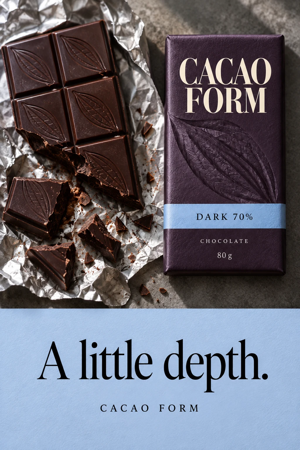
I developed a chocolate identity that treats the cacao pod as a material impression rather than a conventional illustration.
- Year
- 2026
- Disciplines
- Visual identityPackaging design
The challenge
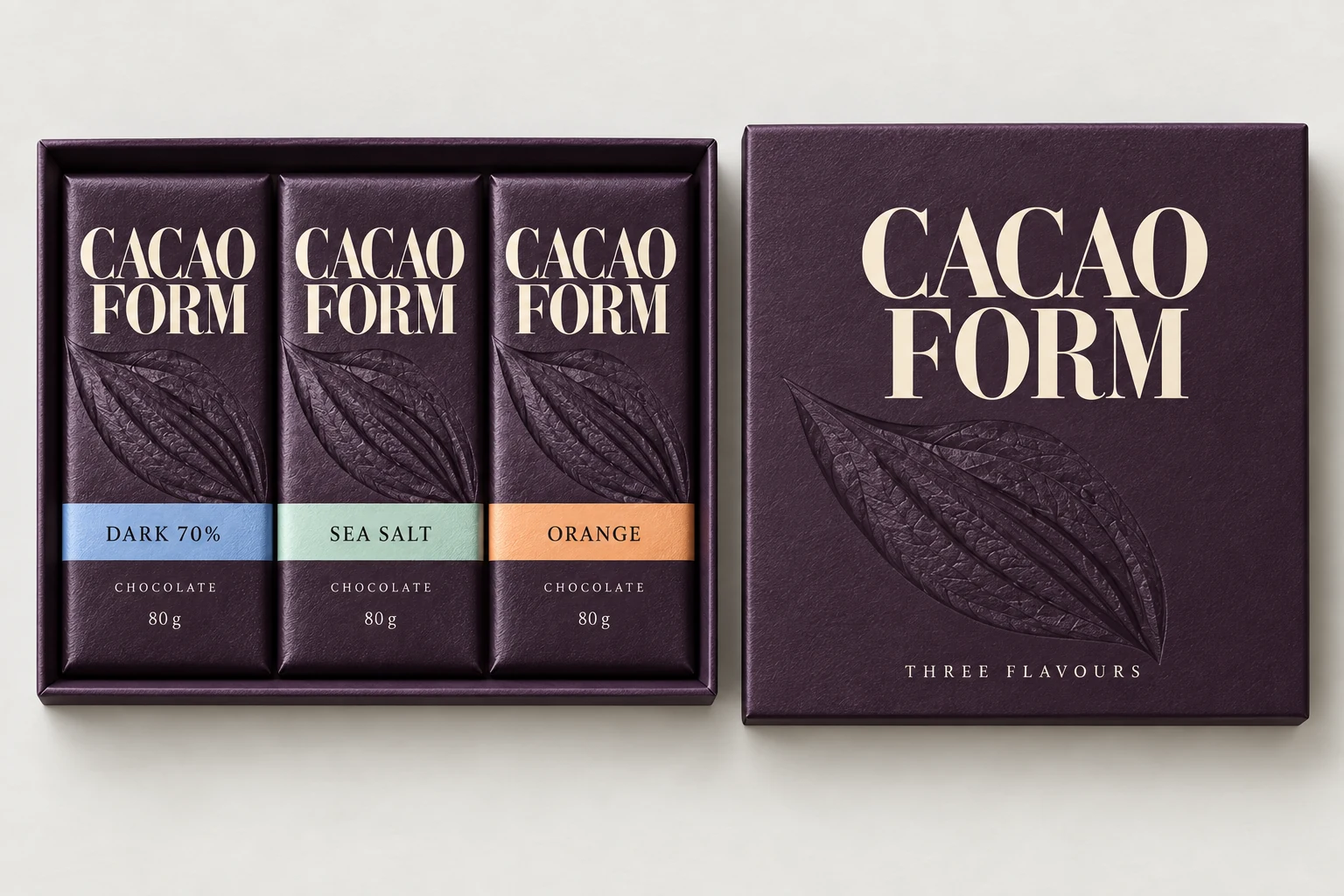
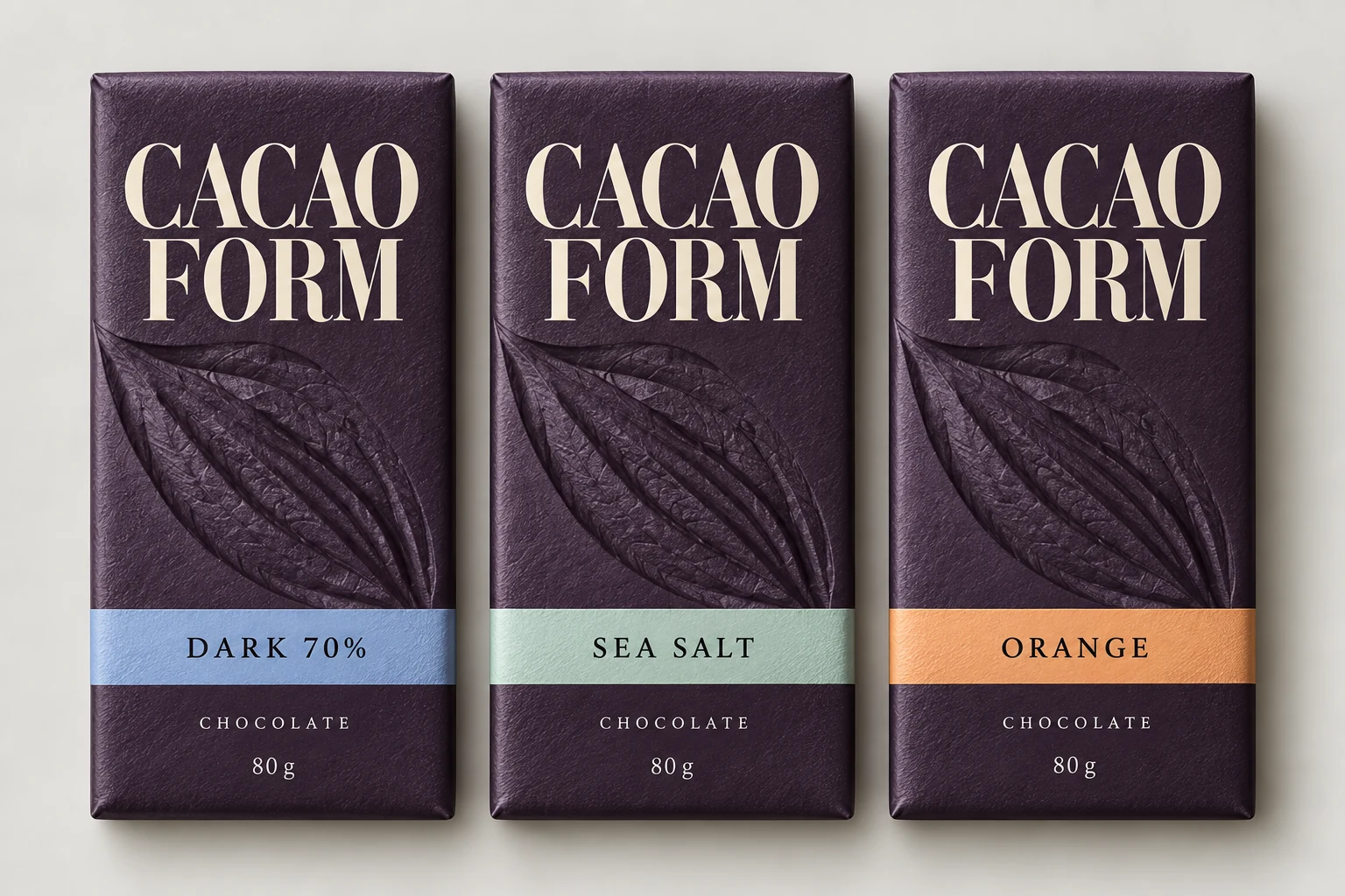
The family needed a distinctive premium presence without relying on metallic decoration. Its variants also needed to remain easy to distinguish.
The idea
The name links ingredient and physical form. A pressed pod motif connects the paper wrapper to the molded chocolate within.