Loading work…
Art
TEKAN / Form Under Pressure
Self-initiated project
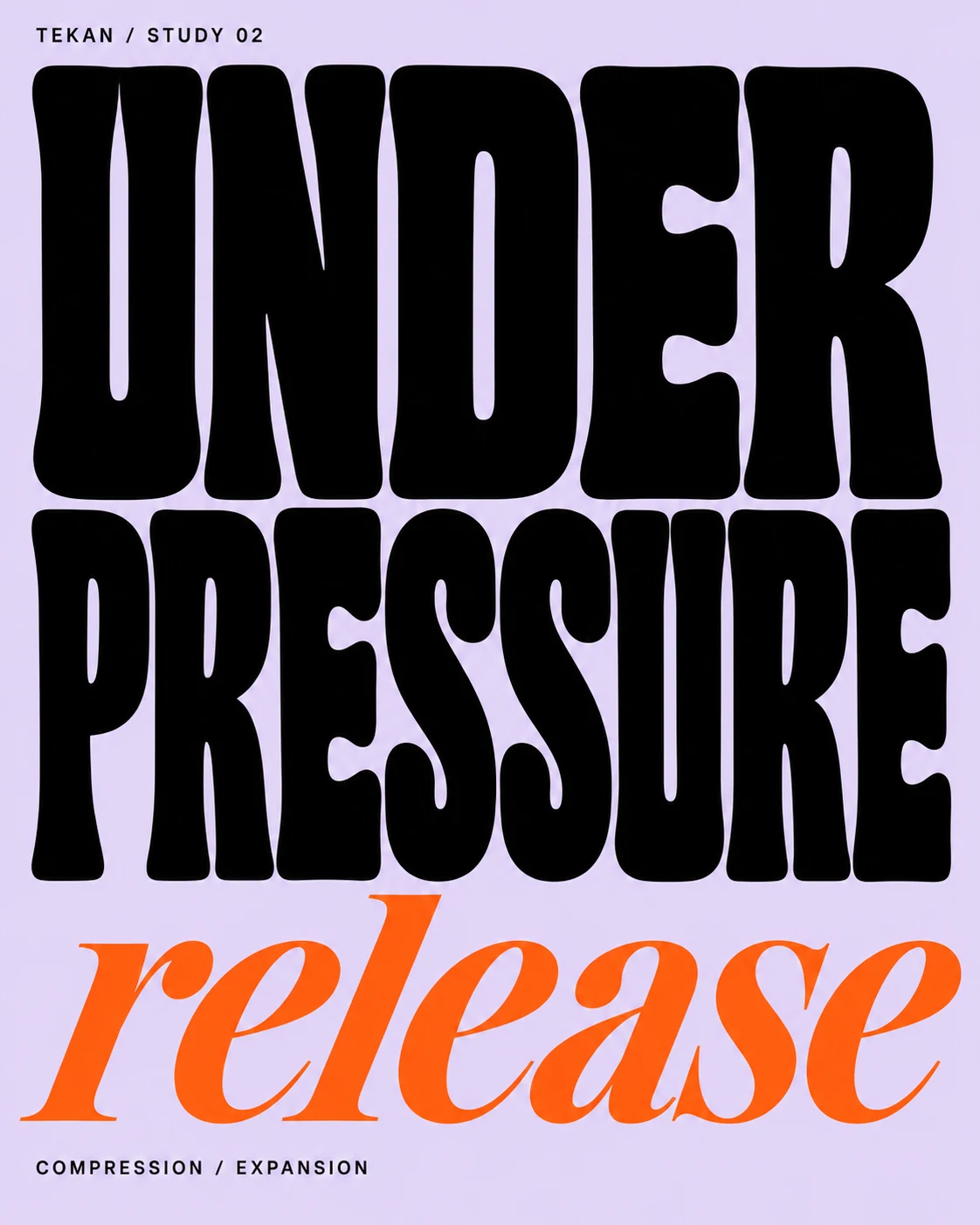
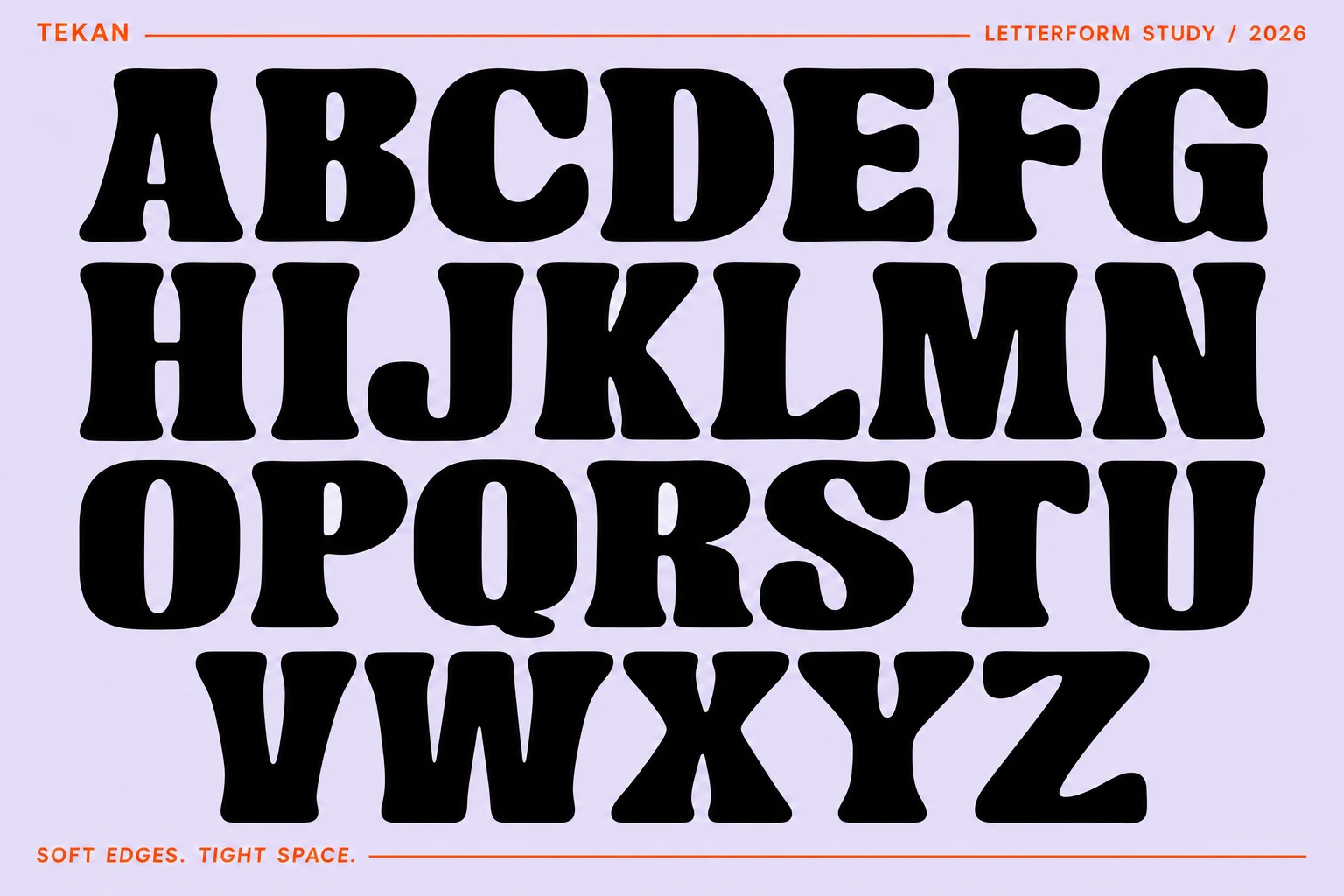
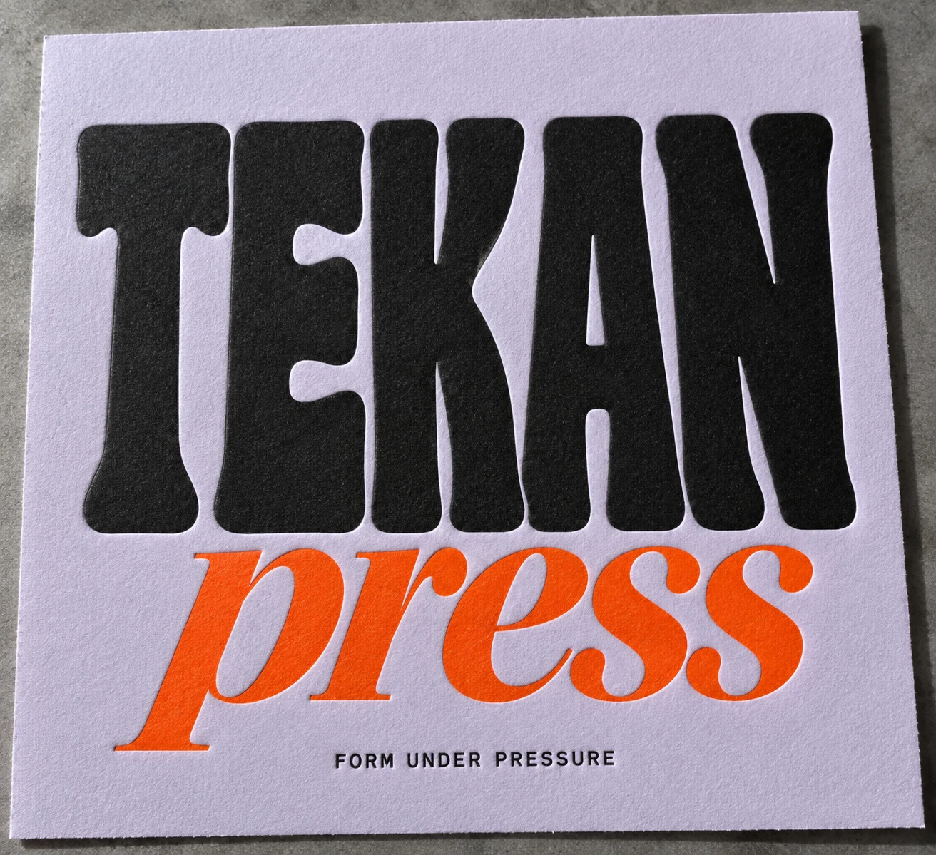
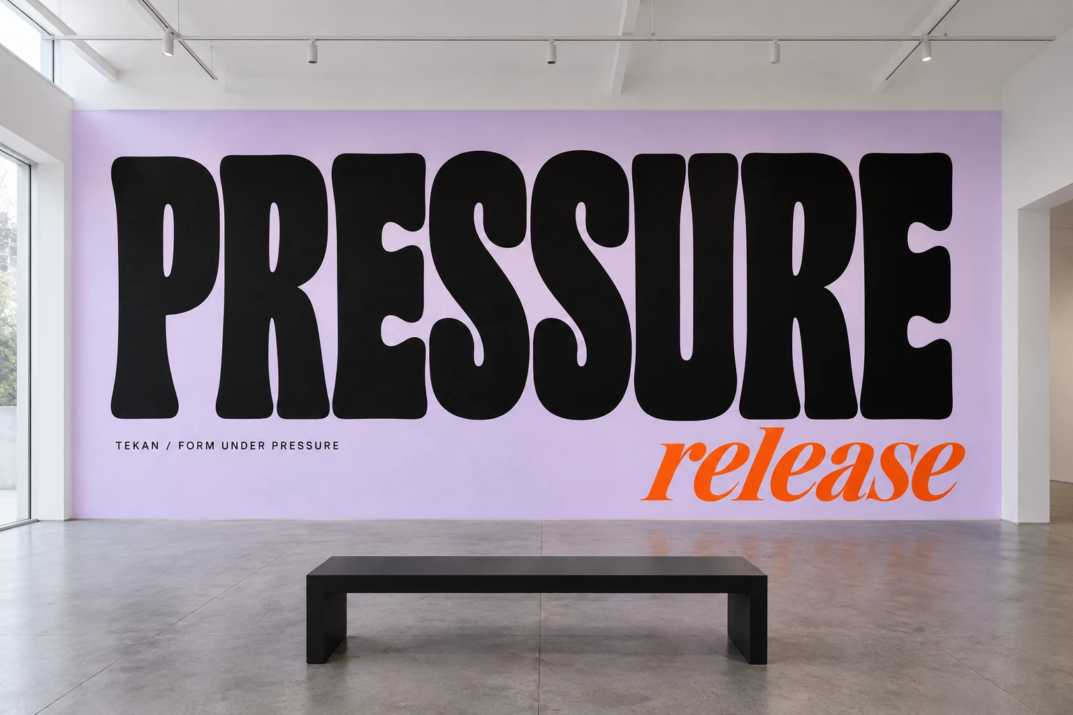
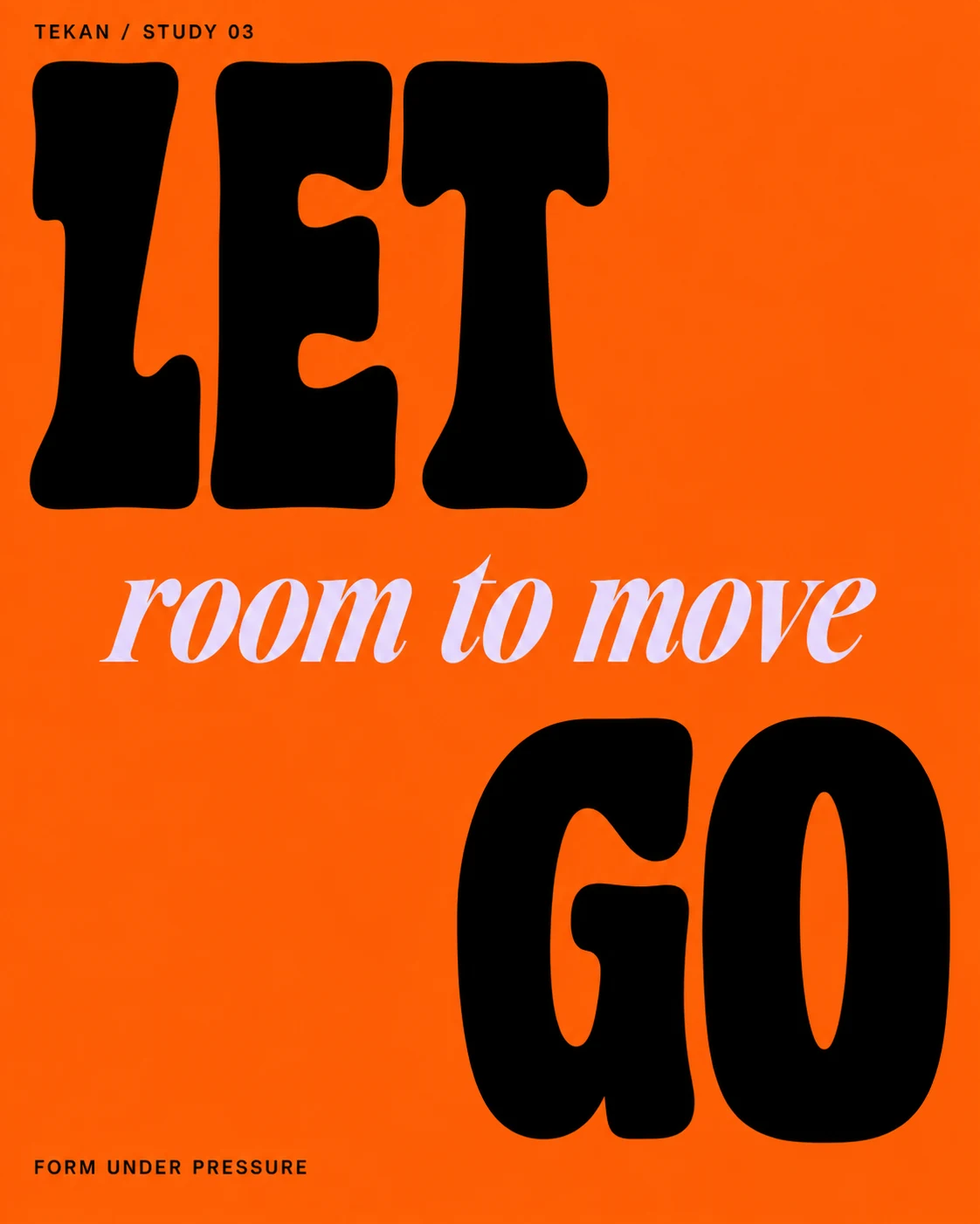
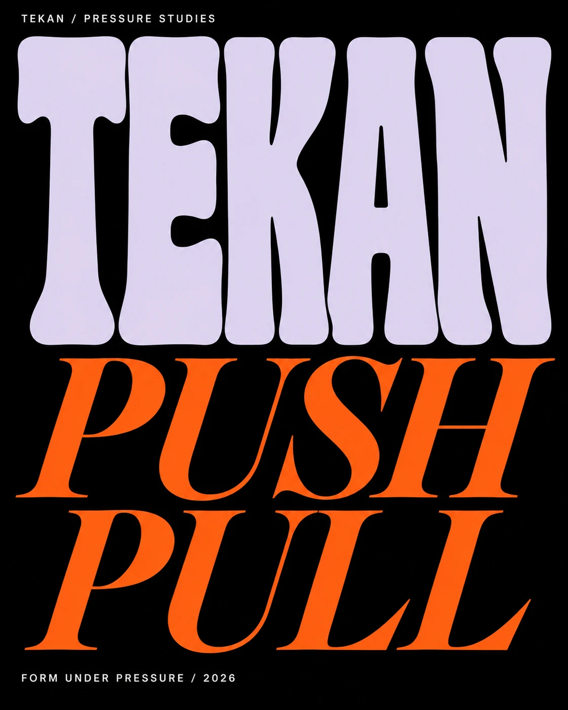
I explored pressure as a typographic condition. TEKAN places soft, heavy letterforms beside a sharp italic serif, moving between crowded compositions and open space. The name is Indonesian; the specimen and campaign language are English.
- Year
- 2026
- Disciplines
- TypographyEditorial designArt direction
The challenge
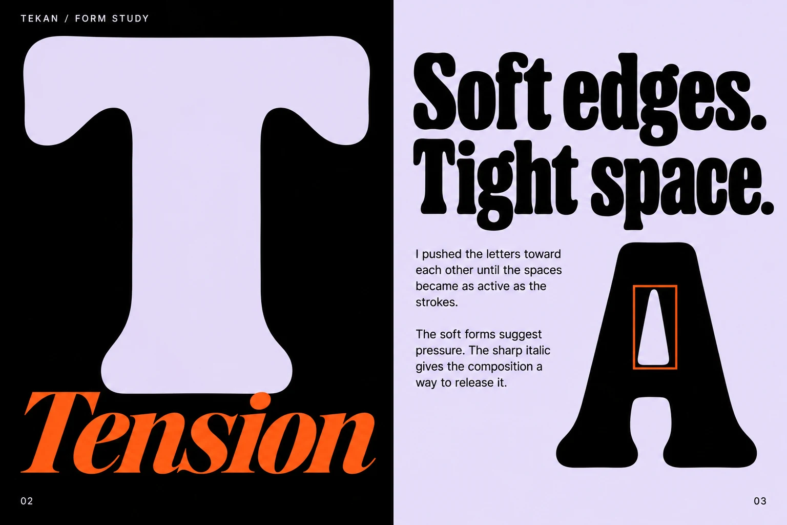
The experiment needed expressive forms without sacrificing recognizable words. I wanted the spaces within and between the letters to carry as much character as the strokes.
The idea
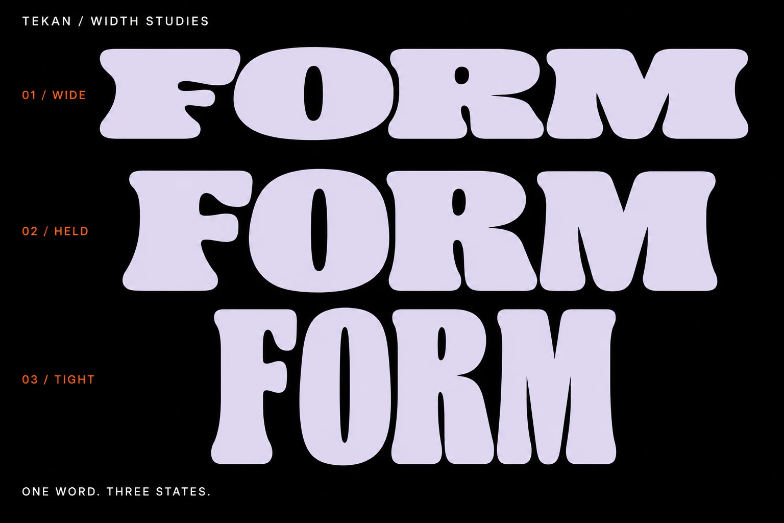
Compression and release. Bulging edges suggest a form being pressed into place; the italic cuts through it with a contrasting direction and weight. Changes in width, scale and spacing make the same vocabulary behave differently.